Rubik's Cube Package Redesign
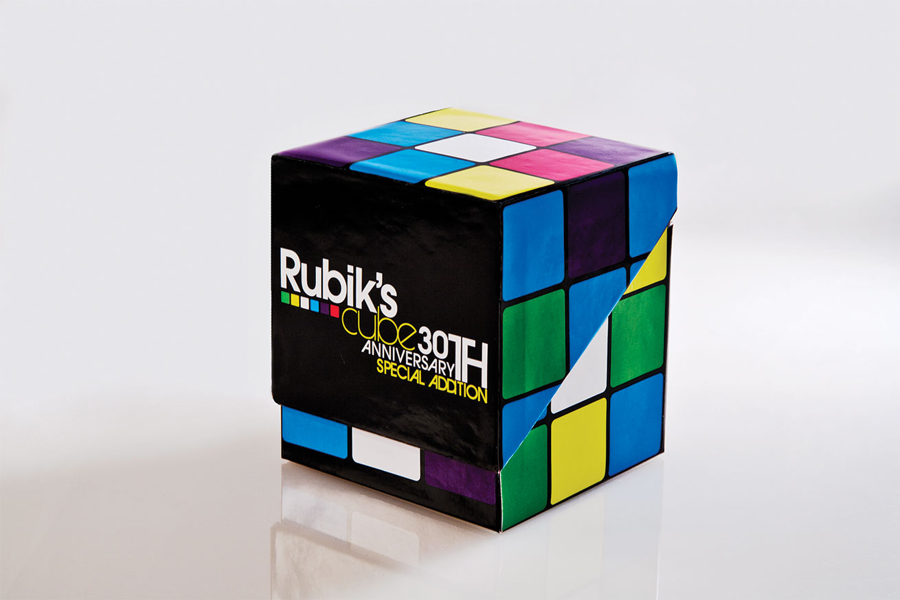
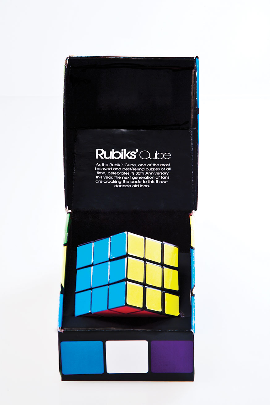
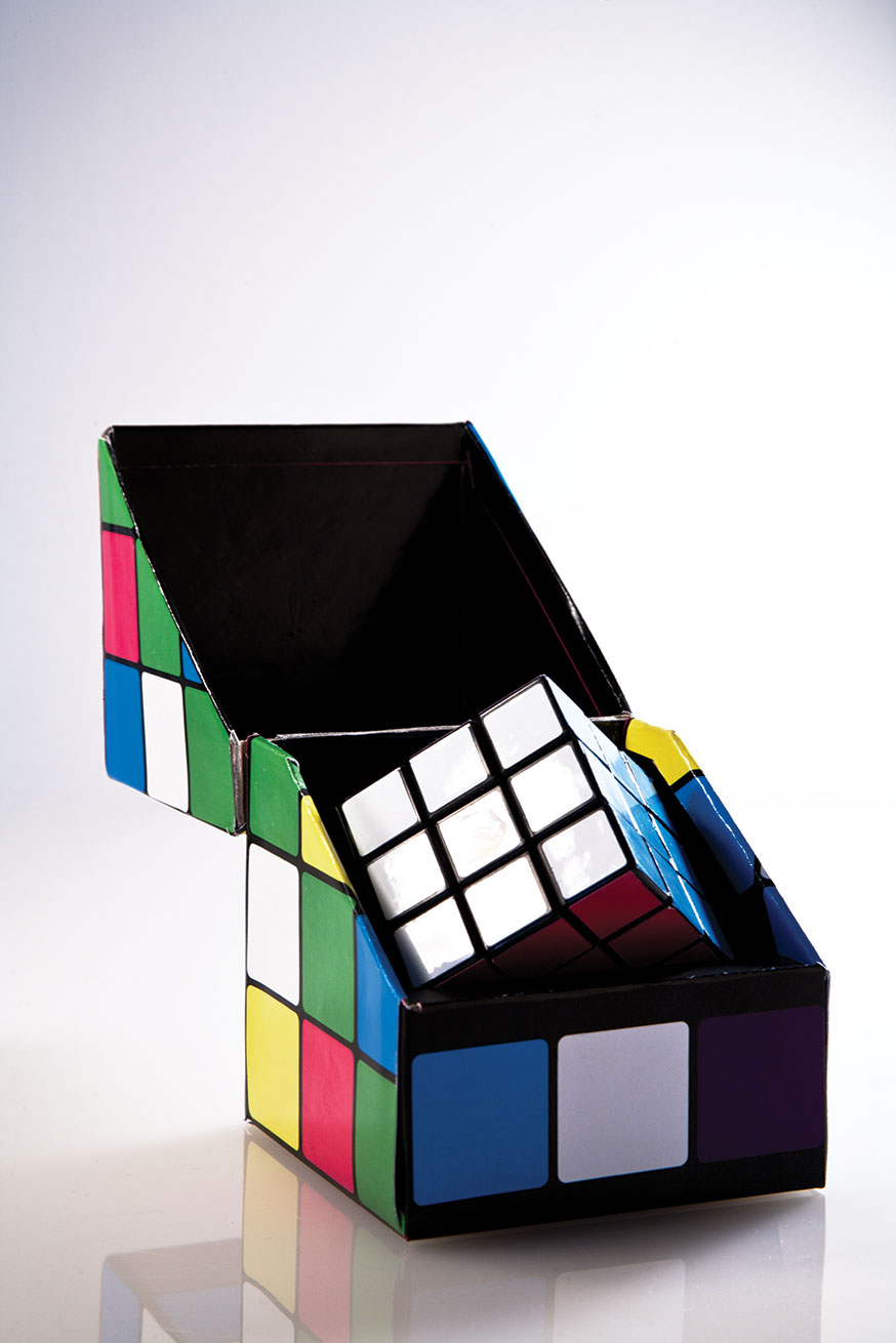

My Goal for this package redesign project was to create a new and invigorating solution to a package for a timeless toy that has become a mass-produced, cheaply-packaged thing of the past. To achieve this goal I utilized an innovative hinged box design with a 3 dimensional feel and updated colors to enhance the brand and welcome the future.
Research & Discovery
This package redesign project began with researching an existing package by sifting through the toy isle of Target. Searching for the right piece of nostalgia I came across the timeless Rubik's Cube that was suffocated within its stiff plastic prison that was probably designed with only the creative strategy of saving money.


The old packaging was colorful and plastic maintaining their original color scheme of red, orange, yellow, blue, green and white. The packaging is very cheap and is apparent that they can produce a lot of these in one day in a factory in China. The cube has basically remained unchanged since its inception 30 years ago.
Inspiration & Concepts
Exploration
Type Studies
Logo Design
Final Thoughts
The toy isle in most stores is saturated with primary colors in a sea of plastic. With this new design, I want to attract a larger audience than the typical child flailing down the toy section leaping towards the plastic brightness. The new design should scream innovation, progress and future for a toy that is timeless and has academic merit and an embedded educational value. The simple hinged box design and the relatively simple graphic representation of the Rubik's Cube should be all that it needs to thrive and flourish on the shelf.